Lost in the internet cloud? This blog is Azo's version of bread crumb trail, to help him recalls everything back so that he won't lost. And now this blog is a Swiss Army Knife of internet technology.
Thursday, August 28, 2008
Wanted Blogger Template
This template were based on Wanted 2008 Movie (IMDB). At first I saw the wallpaper photo and I thought maybe I could come out with a blogger template. Well here it is, 2 column Blogger template:
To copy the code, click on "View Plain" and copy the template code:
OR you can DOWNLOAD.
Labels:
blogger template,
wanted
Monday, August 25, 2008
How to scan text directly into Microsoft Word using OCR
One day my boss asked me to get a soft copy of an annual report. He gave a 400 pages report book and he want it done by the end of the day. Luckily he just needed some portion of it but still the amount were a lot and can't possibly done in one afternoon. So I'm thought that it would be better if I can scan the text report directly using a scanner and grab the text and past it into a Microsoft Word document. And that was exactly what I did.
I'll show you how I done it. This method require a copy of Microsoft Office 2007 or later. What you need to do is to install the Microsoft Office Document Scanning tool. It is shipped with Microsoft Office as an optional tool However the tool is not install during the Microsoft Office normal installation.
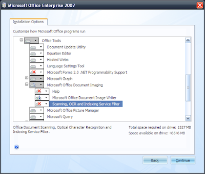
Step 1: Go to Control Panel > Add or Remove Programs. Search for Microsoft Office 2007. Click change button. Choose add or remove feature on the next screen. Next you will get this pop-up
Step 2: Scroll down to the 'Office Tools' and expand it. Expand the 'Microsoft Office Document Imaging'. You will get the following options feature.
Select 'Run on your Computer'. That's it, you are done.
How To Change Blogger Favicon
What is Favicon?
Favicon (abbreviation of "favorites icon" and also known as a page icon), is an icon associated with a particular website or webpage that is displayed in the browser address bar next to a site's URL.By default, Blogger inserted their own favicon. Do you know that you customize and install your very own favicon? Here's how...
Before we start, you will need an icon image with .ico extension. If you don't have any, there several tools that you can use to create one. But if you're totally clueless, you can create it using an online tool. Once generated, save it on your desktop and follow this step:
Step 1: You need to host the icon image somewhere by uploading the icon to your favorite image hosting. You can try Oogle Toogle or imageshack if you want. Copy the published url as your reference.
Step 2: Go to your Blogger Dashboard > Layout > Edit HTML.
There find the title tag which looks like this:-
<title><data:blog.pagetitle/></title>
and add the following code:
Change the URL-of-your-icon-file to your actual icon URL that you get from step 1.
Step 3: Save the template, refresh your blog and you are done.
Labels:
favicon. blogger,
how to
CSS 3 Column Blog Style Liquid Layout
There are tonnes of method can be done to achieve this 3 column blog style layout, but I found a CSS layout from Matthew James Taylor and want to keep this as my reference because of its simplicity and straight to the point. So maybe you want to take a look.
Basically this is what we're trying to achieve with this CSS layout design:As shown above the center and right column widths are in pixel and the left column is the main content area will control the page height.
Update:
Since the author himself (Matthew James Taylor) found out about this page and ask to link back to his work rather than I post the CSS code here as "my own reference" well I respect that and remove the source totally. But using the word "steal" seems a little bit harsh here, I rather called it an open source. Beside this blog not even mine, it's Google's. I just put in some words. The author also said something like "some minor cosmetic changes". It's an indicator that I spent some amount of time to test out and verify each line of CSS code, print screen it and post it here. Not just simply put all the source. Beside it's just another CSS layout, the author might claiming all 3 columns layout website or patent the 3 columns website in a future as his invention. Yikes!! In the event of the author's hosting server under maintenance or out of service (some personal website has this problem), I post a copy of the code anyway.
Labels:
css
Thursday, August 21, 2008
How To Post Code Snippets in Blogger Post
This issue haunting me for almost 2 years now (yup that long). I never properly research how it can be done before, not until last night. I have to enable this feature due to several factors where I need to post any sample snippet code directly to the blog post. However you need some tag into HMTL special character first.
As you notice (check for the blogger template tag), I start posting Blogger template for Blogger user. I did it because I want to channel out my art inspiration that clogging my mind. Anyway I thought maybe I could post the whole template (XML file) in the respective post. Later on I found that, Blogger just won't let you post some specific tag like <html> or <head> or <title> no matter what. So what is the point if it doesn't solve the issues? Read on...
Most people would say that using the <pre> would solve it. But I found a much better way to present your snippet code in your blog post. It is called SyntaxHighlighter. It quite easy to set up if you have your own domain as it requires some include files like css and javascript for coding syntax brushes where you can get it from the same website. No worries I'll show you how to deal with this. Read the step bellow:
1) Upload the SyntaxHighlighter files to your server.
2) Include the SyntaxHighlighter.css file at the top of your page, inside the head tag.
3) At the bottom of the page, just before the end body tag, include the brushes and other js files you will need, as well as the function call to stylize the <pre> tags:
4) Now you can start using it by placing your snippet code in between these two <pre> tags that the javascript will stylize
As you can see above, the result is much better.
Note:
You might find extra <br> tag in the posted code. This is due to the Blogger setting. By the dafault Blogger will automatically add <br> tag for each new line. There are to ways to fix this issue:
As you notice (check for the blogger template tag), I start posting Blogger template for Blogger user. I did it because I want to channel out my art inspiration that clogging my mind. Anyway I thought maybe I could post the whole template (XML file) in the respective post. Later on I found that, Blogger just won't let you post some specific tag like <html> or <head> or <title> no matter what. So what is the point if it doesn't solve the issues? Read on...
Most people would say that using the <pre> would solve it. But I found a much better way to present your snippet code in your blog post. It is called SyntaxHighlighter. It quite easy to set up if you have your own domain as it requires some include files like css and javascript for coding syntax brushes where you can get it from the same website. No worries I'll show you how to deal with this. Read the step bellow:
1) Upload the SyntaxHighlighter files to your server.
2) Include the SyntaxHighlighter.css file at the top of your page, inside the head tag.
<link type="text/css" rel="stylesheet" href="SyntaxHighlighter.css">
3) At the bottom of the page, just before the end body tag, include the brushes and other js files you will need, as well as the function call to stylize the <pre> tags:
<script language="javascript" src="shCore.js"></script> <script language="javascript" src="shBrushCSharp.js"></script> <script language="javascript" src="shBrushXml.js"></script> <script language="javascript" src="shBrushPython.js"></script> <script language="javascript"> dp.SyntaxHighlighter.ClipboardSwf = 'clipboard.swf'; dp.SyntaxHighlighter.HighlightAll('code'); </script>
4) Now you can start using it by placing your snippet code in between these two <pre> tags that the javascript will stylize
<pre name="code" class="html"> <!-- code here --> </pre> <pre name="code" class="python"> # code here </pre>
As you can see above, the result is much better.
Note:
You might find extra <br> tag in the posted code. This is due to the Blogger setting. By the dafault Blogger will automatically add <br> tag for each new line. There are to ways to fix this issue:
- You can disable this Blogger feature at Settings > Formatting > and set the Convert line breaks to 'No'. However from here onward, each of your blog posting will be one liner. Yup, no matter how many new line you made, your blog entry output will be in one line.
- Another method is to fix the SyntaxHighlighter by adding this specific script. Go to this line (at the step 3 above)
<script language="javascript"> dp.SyntaxHighlighter.ClipboardSwf = 'clipboard.swf'; dp.SyntaxHighlighter.HighlightAll('code'); </script>
Well ditch that that part and add this one.
Thanks to Hongjun for that fix.
Labels:
how to,
SyntaxHighlighter
Wednesday, August 20, 2008
Free Online File Sharing and Storage
I rarely share any file before accept for my own use or for work related file when it is too large to attach in email. But today I need some extra feature from any of the online storage service. Beside the ability to publicly share my files, I need to manage my file that can be place in online folder and I need to know how many download for each file. There are a lot of choices out there but how do I know which is the most suitable for my usage? So the hunt begin...
For easy future reference, I'm going to arrange the online storage service into several categories:
One of the most popular file sharing out there. You can upload straightaway as a guest or subscribe their Premium Account to download a with a speedy connection. You also can get a Free Premium Account by collecting RapidPoints. You just need to place your file in Collector's Zone in order to get the points.
Perhaps Megaupload is one of the leading provider of online storage. Megaupload allows to send files up to 500MB, offers ad-financed free and affordable premium online storage, sophisticated uploading and downloading dekstop tools, and high-volume business accounts including pay-per-download. Megauploadalso rewards you with a point for each dowloaded file.
It used to be my favorite storage, eSnips is a social media sharing site that provides 1GB of free storage to upload any type of file. Files can be organized into folders and for each folder you can determine a different privacy setting. Folders can be private, shared with a group or public. However, the current auto copyrighted materials detection is completely suck. You can't upload script or code snippet anymore. The engine will automatically block it even if you ZIP it.
Uploaded files stay online forever. Or course it comes with pop-up / pop-under ads page.
MediaFire allows free unlimited uploads, unlimited downloads, unlimited bandwidth, multiple simultaneous downloads and you have an option to upload a file without creating an account. But the free account is not bad either. My kind of favorite online storage service.
It is a service that allows you to have 1GB of free online storage without ads. That's right, no ads. The details plan can be view here. Box.net easily becomes my favorite due free of ads and clutter.
For easy future reference, I'm going to arrange the online storage service into several categories:
- File Manager & GUI
- File Size Per Upload
- Storage Quota
- Statistic
One of the most popular file sharing out there. You can upload straightaway as a guest or subscribe their Premium Account to download a with a speedy connection. You also can get a Free Premium Account by collecting RapidPoints. You just need to place your file in Collector's Zone in order to get the points.
- File Manager & GUI
Downloadable desktop application but this is strictly for Premium Account (paid). - File Size Per Upload
200 MB per file upload or a batch of file with sum not exceeded 200 MB - Storage Quota
Unlimited - Statistic
Perhaps this is available for Premium Account
Perhaps Megaupload is one of the leading provider of online storage. Megaupload allows to send files up to 500MB, offers ad-financed free and affordable premium online storage, sophisticated uploading and downloading dekstop tools, and high-volume business accounts including pay-per-download. Megauploadalso rewards you with a point for each dowloaded file.
- File Manager & Member Dashboard GUI
Provides the online and desktop file manager (Mega Manager). The online dashboard is flash based. - File Size Per Upload
1024 MB - Storage Quota
Unlimited - Statistic
Available for Free or Premium Member. As for the free membership, the statistic consist of download hits based global / country popularity.
It used to be my favorite storage, eSnips is a social media sharing site that provides 1GB of free storage to upload any type of file. Files can be organized into folders and for each folder you can determine a different privacy setting. Folders can be private, shared with a group or public. However, the current auto copyrighted materials detection is completely suck. You can't upload script or code snippet anymore. The engine will automatically block it even if you ZIP it.
- File Manager & Member Dashboard GUI
Available with some Ajax touch - File size per upload
100 MB - Storage Quota
1 GB - Statistic
Basic view counts with no of user's ratings and favorite
Uploaded files stay online forever. Or course it comes with pop-up / pop-under ads page.
- File Manager & Member Dashboard GUI
The dashboard is simple with some Ajax touch. However the public download page is full of ads. A little bit off to me. - File Size Per Upload
200 MB - Storage Quota
5 GB - Statistic
Simple download counts
MediaFire allows free unlimited uploads, unlimited downloads, unlimited bandwidth, multiple simultaneous downloads and you have an option to upload a file without creating an account. But the free account is not bad either. My kind of favorite online storage service.
- File Manager & Member Dashboard GUI
Very organized online file manager. You can creatte unlimited folder and multiple files per single upload session with Ajax touch. The public download page is uncluttered with ads with clear download link. - File Size Per Upload
100 MB for free account, 10 GB for MediaPro (paid member) - Storage Quota
Unlimited - Statistic
Simple download counts for free account. For the MediaPro a complete set of statistic are available (popularity, geolocation & refferers)
It is a service that allows you to have 1GB of free online storage without ads. That's right, no ads. The details plan can be view here. Box.net easily becomes my favorite due free of ads and clutter.
- File Manager & Member Dashboard GUI
Very much similar to MediaFire with Ajax. The public download page has no ads at all. - File Size Per upload
10 MB - Storage Quota
1 GB - Statistic
Basic download counts.
- DepositFiles
- xDrive
- Supload
- Quicksharing
- Megashares
- Egoshare
- Kotuha
- Uploading
- Upload2
- Datafilehost
- Turboupload
- Speedyshare
- Uploadingit
- Mozy
- Zupload
- Evilshare
- Storeandserve
- Mihd.net
- YourFileLink
- MyotherDrive
- DropBoks
Labels:
Online Storage
Tuesday, August 19, 2008
BirdNest Blogger Template
The "Bird Nest" Stadium - Beijing, Summer Olympic 2008.
Inspired by the summer Olympic 2008, I've created this template for Blogger user. If you just created the Blogger account and have not activated any Blogger gadget yet, you can just upload the XML straight away.
Alternatively you can directly Download Template
Labels:
blogger template,
olympic
Sunday, August 17, 2008
Facezbook Web Forgery
I received a message from one of my Facebook contact. It says:
It happen that I do blogging and curiosity urging me to click the link. The link brings me to a Facebook login page, but wait, something is not right here...
Firstly, my Facebook is just next to the Firefox browser tab. Why Facebook ask for my credential again? Secondly, as you can see above, the URL is not Facebook, its Facezbook. From that point I realized that it's a phishing or web forgery. Lurking my real Facebook credential.
So I did play around with it a bit. Fill up a bogus username & password. Somehow the Firefox intercept it (is it? not so sure about this) and display a warning page:
Just be careful. Phishing link is now haunting in your Facebook Wall.
"Wow... look what somebody wrote about you in their blog... it's a bit harsh. check it out Go here http://!@#$%^&*.blogspot.com"
It happen that I do blogging and curiosity urging me to click the link. The link brings me to a Facebook login page, but wait, something is not right here...
Firstly, my Facebook is just next to the Firefox browser tab. Why Facebook ask for my credential again? Secondly, as you can see above, the URL is not Facebook, its Facezbook. From that point I realized that it's a phishing or web forgery. Lurking my real Facebook credential.
So I did play around with it a bit. Fill up a bogus username & password. Somehow the Firefox intercept it (is it? not so sure about this) and display a warning page:
Just be careful. Phishing link is now haunting in your Facebook Wall.
Labels:
Facebook,
Phishing,
web forgery
Saturday, August 16, 2008
The New Blogger Update
Blogger team must been busy updating the Blogger system lately. There a few new enhance features published and I love it all especially the Blogger gadget. Hmm, the update never this aggressive before, are they up to something...
The Blogger Gadget section is now more organized with tonnes of gadget possibilities. Even you can create your own gadget (must be hosted somewhere else though). Everything else is organize by Basic, Featured, Most Popular, Newest and several other categories.
The Blogger Dashboard also cosmetically enhance, which I find it just OK. The old functionality still there, Blogger just enhance the CSS design of the blog list.
They also enhance the AdSense page element by enabling the image Ad. They found that image ads have a higher click-through rate so the user could get richer. Hahaha. I think the text link ad is could perform much better. Unless if they enable the video ad, now that is a different story.
With these updates, I think that the Blogger is considered one of the easiest blogging tool out there compared to others. It is about time that I contribute something to the Blogger user. Perhaps some kick-ass template or gadget. You can click on the link with the Blogger Template label on the right in future (of course when it is clickable).
Labels:
blogger
Friday, August 15, 2008
Dell Studio Hybrid Desktop Is Just Like a Candy
I'm a fan of small PCs and even dreaming to install a mobile PC in my car. At that time, I only able to build a PC based on Mini-ITX motherboard. It never materialize as I was searching over and over again for a suitable casing. When the Apple Mac Mini introduced, it was awesome but the price still on the steep side (need to fork another thousand ringgit for the display). Then, Dell came up with this gem called Dell Studio Hybrid Desktop. Wow...
Features:
- 7 interchangeable sleeves colour
- 80% smaller than most desktop PC
- Come with optional wireless keyboard & mouse (great bargain for sure)
- Use 70% less power than typical desktop PC (energy saver means less electrical bill to pay)
- Analog and Digital sound outputs
- Built-in Draft-N Wireless Networking
- HDMI and DVI output
In Malaysia, the price for a complete system at the moment (14 August 2008) is starting from RM 2,899.00 inclusive of delivery.
Let's watch Jason unboxed a unit of Dell Studio Hybrid to evaluate is it worth to drool on this cute candy like PC from Dell
Yup, it worth it. As for me it is just a matter of time to get a unit.
Labels:
Dell,
Studio Hybrid Desktop
Thursday, August 14, 2008
The future of Web is here
Freebase Parallax: A new way to browse and explore data from David Huynh on Vimeo
If you want to do some research work on a topic, normally you would pop the browser and search the topic through Google or Wikipedia and click one by one the related URL link. And then extract all information into your notepad or words etc. This is tedious work and you wish that if there is another way, a much better way to help you out? Yes there is, read on.
The principle of this new kind of technology is called semantic web. It's kind of complicated way of handling a data if you ask me, because a single search will divided in several set instead of one to one search result.
Freebaseis one of the application out there that handle this kind of data. It is a global knowledge base: a structured, searchable, writeable and editable database built by a community of contributors, and open to everyone.
But on top of Freebase, David Huynh has designed a novel browsing interface called Parallax where it enhance data result even further.
However, as I search through Freebase data through Parallax, the data that I found will depends how popular the topic is. Of course the the US president will hits lot set of data, but when I search the Malaysian Prime Minister for example, it only shows few things. Maybe we should let the Freebase mature first, or better let participate by becoming one of the contributor. You judge.
Labels:
freebase,
semantic web
Sensational Title - Cashier No 16.3gp
If you want to know the important rule of search engine optimization (SEO), selecting the right page title is one of crucial part. For this example, I'm borrowing the local news keyword 'Cashier No 16.3gp' as part of this blog title. The news were actually about a cashier... well I don't have to elaborate more, read it yourself. It just The important thing is that to choose the most sensational title that you can imagine of. If you are part of the subject in local news, grab that keyword and integrate it in your post. Your page view will sky rocket high for sure.
To all Malaysian folks, if you're looking for this particular video, I'm sorry it is not here. Even though if I have it with me, I won't publish it. I don't want the cops knock on my door searching my PC tonight. This is just a another SEO experiment to study how my fellow Malaysian behave. I'll post my finding later on. Peace.
Labels:
SEO
Tuesday, August 12, 2008
GMail - Error 502
This error occur yesterday. According to the Google official blog, apparently GMail experiencing a temporary outage in GMail contact system. You know, the section where you save all your friends and contacts info in your GMail application. Luckily I was already at home (GMT +8 Malaysia time) so my GMail or other Google app usage normally drop to 5% only. I'm kind of get to use of this accessibility problem anyway.
Previously, even though my GMail is working, I usually still experiencing some glitch due to either my ISP or my office network congestion. This kind of glitch makes me wondering, are we ready to adapt a full blown service-based software or the Microsoft Outlook still shine for at least 10 more years? A tough question indeed don't you think?
Labels:
Error 502,
GMail,
Google,
Troubleshoot
Google Lively - Yet another fantasy chat room
Have you try out the new Google's app called "Lively" lately? yes, no, yes, no? If no, then a short word to describe this app would be, it is just like Second Life. Meaning, it is a platform that lets user create and personalize avatars and their own virtual rooms. Than what so special about it? Read on...
After personalizing to your own taste, you can embed your room to their website, your own blog, Facebook or Myspace pages.
You need to download the app first and the app is running through Internet Explorer or Firefox. Even though the Lively is free, the optional accessories for your avatar like cool shirt or hat is on sale.
To me this personalize avatar and chat rooms is nothing new. I did try out this type apps few years ago and I'm still wondering why do they create this app. It's more like meeting up in a fantasy room doing stuff that they can't do in real life. Get real people.
Monday, August 11, 2008
Olympic 2008 Medal Update
I add the top 10 country Olympic 2008 medal count widget on the right to alert me if Malaysia ever get the top 10. I wonder who will get the first 1 million Ringgit as the Olympic gold medal reward. Get your Olympic Medal Update widget at the official site.
Labels:
Olympic 2008,
widget
Friday, August 08, 2008
Olympic 2008, Beijing - Youtube Channel
Hey, did you catch the opening ceremony just now. What a spectacular synchronize show. If you missed it, don't worry. You can still watch it (legally) at Youtube. According to CBC Canada news dated August 5, IOC strikes a deal with YouTube to bring Olympics online. You can watch video feeds at a Channel setup by the Olympic Broadcasting Services (OBS). OK, let's just cut to the chase. Point your browser to http://www.youtube.com/beijing2008 and enjoy the video stream. Catch the Olympic 2008 opening ceremony video.
By the way, apparently you can't embed all video from this channel to your blog. They just won't allow it due to some regions where broadcasters already hold online rights to Olympic video, including Canada. Hahaha, how ironic, I read this news from CBC Canada.
Labels:
Beijing,
Olympic 2008,
Olympic Channel,
YouTube
Subscribe to:
Posts (Atom)